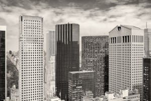
While I think of myself as a landscape photographer first, I enjoy many other photographic challenges. A number of months ago I began working on what might become a new portfolio for me. I call it my “urbanscapes.” These photographs are definitely not landscapes! Some people might call them cityscapes, or urban landscapes, but I’ve come to think the term “urbanscapes” best describes what I’m trying to do. Frankly, I’ve never been one for labels, because with photography, I’m not as concerned about what you call something, as just letting the photograph speak for itself.
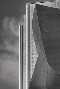 My urbanscapes have a number of characteristics. Stylistically and compositionally they are very graphical, with the shapes, lines, and patterns being dominant elements. Like many of my traditional landscape images, there is a large degree of order and deliberateness. Some of the images may at first seem complex, with many layers of components, but there generally is a simplicity when you look at the totally of the elements in the frame. Because buildings are a major feature in these images, many simple, but important shapes, like triangles, squares, rectangles and curves will be seen and emphasized.
 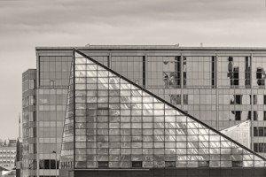 I am trying to capture the beauty of these enormous structures, but also the beauty of the interplay and juxtaposition of the architect’s design elements, especially when there are many structures competing for the viewers attention.
In addition to the graphical elements, I try to convey the “rhythm” of the urbanscape. The rhythm may be a result of the repeating shapes and lines and patterns, or it may evolve out of the myriad of tonalities and how they vibrate throughout the photograph. Strong curves, in addition to highly structured lines can create an interesting rhythmic harmony.
I have decided that my vision of these urbanscapes is best realized in black and white, with the distractions of the real world’s color eliminated. Removing color immediately places the emphasis on the graphical nature of these urban giants. Some of my images are broad and panoramic, but I have also greatly enjoyed composing tighter and tighter and creating abstract urbanscapes. Sometimes less IS more. 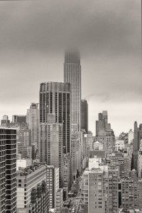 Being able to capture that “extra” element in the photograph, like the Empire State Building partially hidden in fog, is enough to make what might have been a “record” shot, something much more interesting.
My urbanscapes are definitely not “street photography,” where a person or group of people dominate the photograph. My urbanscapes are devoid of people, at least on the surface. In some of my images there are tens of thousands of people within the buildings, but they are not visible. For me, this begs the question of wondering where ARE the people? Is it a working day, a weekend, or has the city been evacuated? I love photographs where a question is implicitly asked, but is left for the viewer to decide the answer.
Stretching oneself photographically is necessary to keep from getting into a photographic rut. I love photographing the city, and it makes getting back out and photographing the wide open landscape even more satisfying. Variety is the spice of photography.


Alan – very thoughtful article. As usual, the photographic examples do a fine job of illustrating your points. Your readers should know that you also have some superb color urbanscapes. I especially appreciate your comment that “stretching oneself photographically is necessary to keep from getting into a photographic rut.”
Rhythm is certainly the operative word for describing these wonderful images. Love the monochrome approach that strips each “-scape” to its essence. I look forward to seeing more.